
WCAG 2.2 and eLearning: A Practical Compliance Checklist for Course Creators
Stop getting lost in legalistic standards. Here is a clear, practical accessibility framework to make your eLearning courses compliant, inclusive, and seamless for all learners.
Executive Summary
The Web Content Accessibility Guidelines (WCAG) 2.2 can feel overwhelming when read cover to cover. For instructional designers and eLearning developers, standards language often creates confusion around what needs to be changed in the authoring tool.
When translated into practical design habits, WCAG compliance breaks down into a manageable set of repeatable actions. Building accessibility directly into your authoring workflow and QA checklists, rather than retrofitting courses after launch, ensures reliable compliance, reduces overall development costs, and creates a better learning experience for everyone.
Key Takeaways (TL;DR)
Design accessibly from day one: Retrofitting published courses for accessibility is vastly more expensive than building compliant assets upfront.
Never rely on color alone: Pair status colors (like red/green) with text labels or distinct icons for color-blind learners.
Test without a mouse: Ensure every button, tab, and drag-and-drop interaction is fully operable via keyboard navigation.
Human-review auto-captions: Auto-generated captions are only a starting draft; they require human edits for technical terms and names.
Control the clock: Allow learners to pause, extend, or disable time limits on activities to accommodate assistive technologies.
The 6 Pillars of eLearning Accessibility Compliance
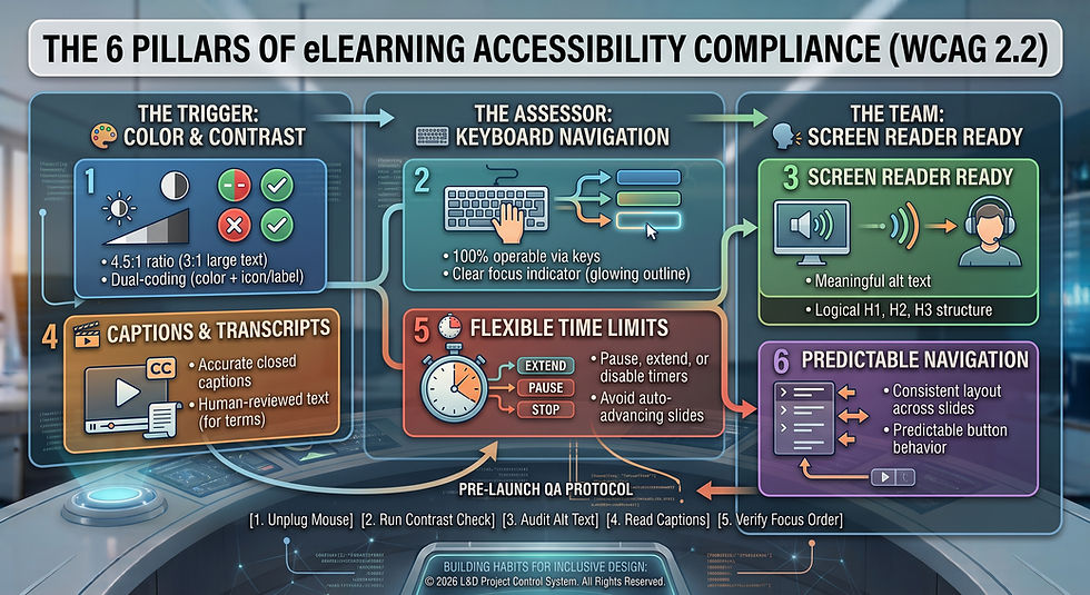
Deep Dive: Applying WCAG 2.2 Standards in Practice
1. Color and Contrast Requirements
Text readability hinges on visual contrast, while meaning must never depend strictly on hue.
Contrast Ratios: Standard text requires a contrast ratio of at least 4.5:1 against its background (3:1 for large text, typically 18pt+ or 14pt bold).
Avoid Color-Only Cues: If a scenario indicates correct vs. incorrect or pass vs. fail, do not rely solely on green and red highlights. Always pair color with an icon (e.g., checkmark/X) or an explicit text label (e.g., "Pass: Complete").
2. Keyboard Navigation & Focus Indicators
Keyboard accessibility is the single most common failure point in custom interactive eLearning assets.
Focus Indicators: As a user tabs through a slide, a visible focus rectangle must clearly highlight the active element.
Interactive Elements: Buttons, drop-down menus, video playback controls, and tabs must be fully functional using only the Tab, Spacebar, and Enter keys.
The Drag-and-Drop Trap: Traditional mouse-based drag-and-drop interactions are rarely accessible out of the box. Provide an accessible alternative, such as a drop-down selection list or accessible radio buttons.
3. Screen Reader Compatibility
Screen readers (e.g., NVDA, JAWS, Voice Over) rely on underlying structural code rather than visual formatting.
Logical Heading Structure: Use actual heading tags (H1, H2, H3) to structure content hierarchy. Do not just make body text large and bold, as screen readers use heading tags to generate slide outlines.
Meaningful Alt Text: Provide concise alternative text describing the learning intent of an image. If an image is purely decorative, mark it as decorative or hide it from screen readers so it isn't read aloud needlessly.
Labeled Form Fields: Ensure text input boxes, survey fields, and quiz choices have programmatically associated labels.
4. Captions, Audio, and Transcripts
Audio content must have a visual equivalent for deaf or hard-of-hearing learners, as well as those in noise-sensitive environments.
Closed Captions: All video and synchronized audio content must feature accurate closed captions.
Human Review Pass: Auto-generated captions from AI or LMS platforms are only a starting point. A designer must conduct a manual pass to correct technical terminology, company-specific jargon, and proper names.
Transcripts: Provide downloadable or expandable full text transcripts for standalone audio files or podcasts.
5. Flexible Time Limits
Fixed time limits create severe barriers for learners using assistive technology or those who require additional processing time.
Control Mechanisms: Any timed quiz, activity, or auto-advancing slide deck must provide options for the learner to pause, extend, or turn off the timer.
Avoid Auto-Advancing Media: Let the learner control when to advance to the next slide rather than automatically forcing a transition when audio finishes.
6. Predictable Navigation Patterns
Assistive technology users rely on muscle memory and consistent layout structures to navigate complex courses.
Consistent Placement: Keep next/previous buttons, menu links, and help icons in the exact same screen location throughout the entire module.
Predictable Behavior: Ensure controls perform the same function every time they are clicked or triggered via keyboard.
Practitioner Playbook: Pre-Launch QA Checklist
Before publishing any course to your LMS or LXP, run through this quick 5-step Quality Assurance protocol:
Unplug Your Mouse: Navigate through the entire module using only your Tab, Shift+Tab, Spacebar, and Enter keys. Can you access every interaction?
Run a Contrast Check: Pass your color palette through a free contrast analyzer (e.g., WebAIM or Adobe Color Accessibility) to verify text meets the 4.5:1 threshold.
Audit Alt Text: Click through every visual asset on your slides. Confirm decorative images are hidden and informational graphics have descriptive alt text.
Read the Captions: Play all video clips with audio muted. Ensure the closed captions accurately match the spoken script word-for-word.
Verify Focus Order: Check that your authoring tool's focus order matches the logical reading order of the slide elements (top-to-bottom, left-to-right).
Final Thoughts & Discussion
Accessibility isn't a restrictive constraint that stifles design—it's a core framework for usability that makes learning experiences cleaner, clearer, and more intuitive for every user. By embedding WCAG 2.2 guidelines into your standard instructional design workflow, you ensure no learner is left behind.
Over to you: What is the biggest challenge your L&D team faces when building accessible eLearning modules? How do you handle complex interactive assets like drag-and-drops?


Comments